Healthdirect Symptom Checker
Overview
Healthdirect is Australia's government funded health information service, reaching millions of Australians across digital and phone channels.
This project was a full redesign of their legacy product, Symptom Checker. It's a triage tool used to help people assess their symptoms and decide on next steps for care.
- Role
- Product Design Consultant
- Impact area
- Public health
- Focus
- Content Strategy
- User Experience
- User Interface Detailing
- User Testing
Making AI health triage accessible and actionable

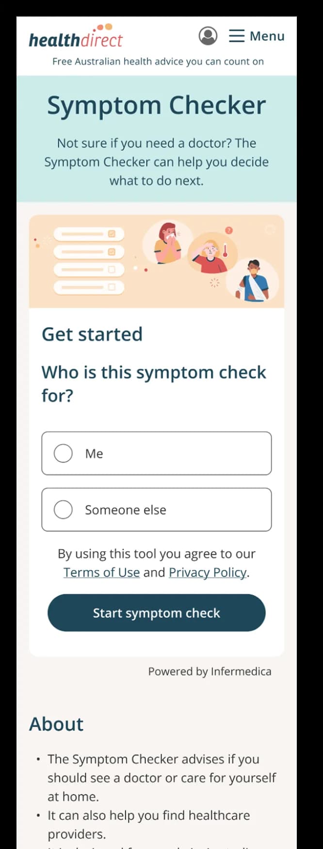

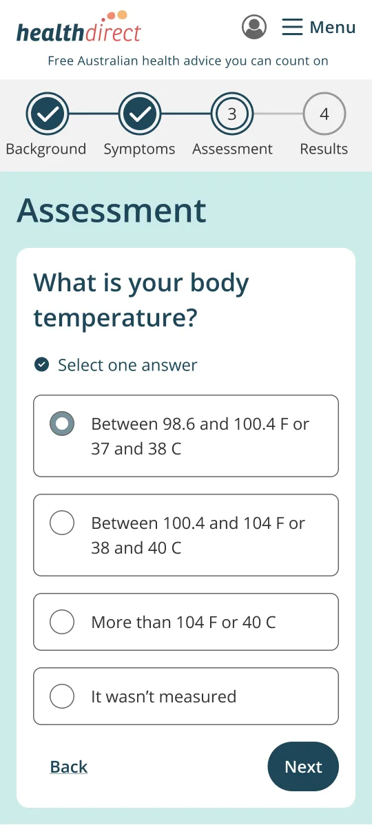
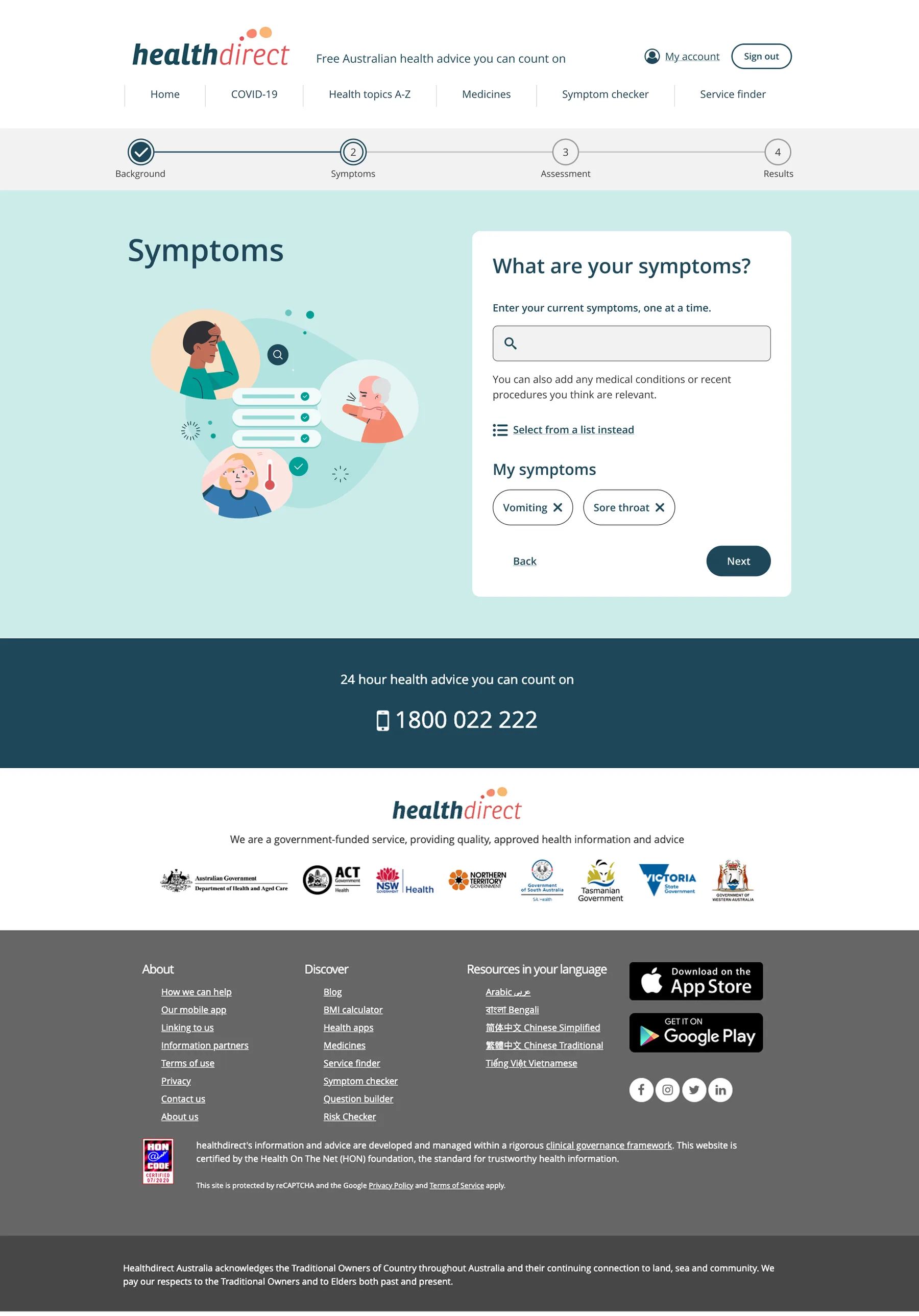
What people said
User response
“It definitely narrows things down really well. And even though I wouldn’t self diagnose anything usually, it gave perspective on how I might feel if I was properly ill.”

The problem
Only 49% of people finished the check, and most dropped off before they saw care guidance.
What success had to look like
- Health literacy
- People understand medical terms and instructions unaided
- Confidence
- People feel guided and supported throughout
- Completion
- 60–70%Reach the industry benchmark
- Task success
- 78%+Every severity 3 and 4 issue resolved
- Step loss
- <20%No single step loses more
- Accessibility
- AAWCAG 2.1, compliant in full

The approach
AI engine audit
Landscape review
User journey
Information architecture
Sketches
AI engine audit
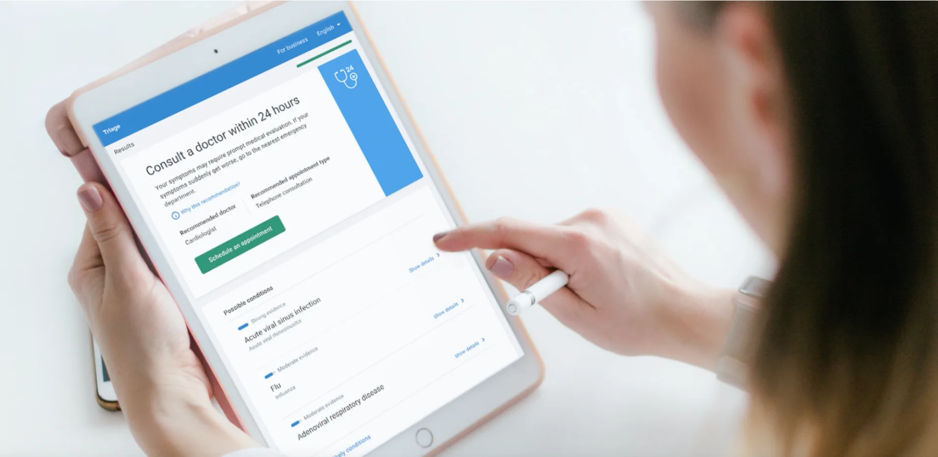
The brief was to rebuild the Symptom Checker around Infermedica, a new AI triage engine, inside Australia's strict clinical standards, legal constraints, and Healthdirect's remit to guide people toward care without diagnosing them. Before any design, we audited what the engine could and couldn't do.
What held up
- Strong clinical reasoning
- Structured symptom assessment
Where trust could break
- Outputs can read as a diagnosis
- Sounds overly certain without supervision
The design agenda
- Reframe recommendations for the Australian clinical and policy context
- Clearer signals on when to move from AI guidance to self-care
The black note marks the core tension. Advice this confident could read as exactly the diagnosis the service is never allowed to give. The design agenda shows how the redesign answered that.
Landscape review
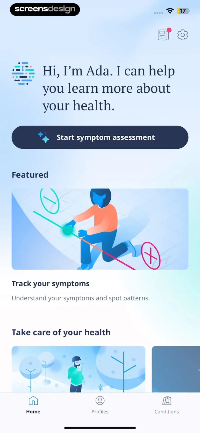
I ran a competitor analysis on a few symptom checkers, and Ada was one of them.
What worked
- Conversational, human voice
- One question at a time
- Visual diagrams demonstrate what a question means
- App shows possible causes for the user's symptoms
- Motion design helps with user engagement
- “Tell me more” on each possible cause removes cognitive load from the report screen
- What worked: Conversational, human voice; One question at a time; Visual diagrams demonstrate what a question means; App shows possible causes for the user's symptoms; Motion design helps with user engagement; “Tell me more” on each possible cause removes cognitive load from the report screen.
- The friction we noted: Poor readability, with small fonts and low contrast on some small text; Tapping an answer is a challenge for big thumbs; Answer options placed too close together; Scanning multiple options not optimal due to right alignment; Some latency in question transitions.
- What we took forward: The patterns that reduced cognitive load, like one question at a time and plain language explanations, became conventions for our own flow; The readability and tap target failures became acceptance criteria for it.
What worked
- Conversational, human voice
- One question at a time
- Visual diagrams demonstrate what a question means
- App shows possible causes for the user's symptoms
- Motion design helps with user engagement
- “Tell me more” on each possible cause removes cognitive load from the report screen
The friction we noted
- Poor readability, with small fonts and low contrast on some small text
- Tapping an answer is a challenge for big thumbs
- Answer options placed too close together
- Scanning multiple options not optimal due to right alignment
- Some latency in question transitions
What we took forward
- The patterns that reduced cognitive load, like one question at a time and plain language explanations, became conventions for our own flow
- The readability and tap target failures became acceptance criteria for it
User journey

Aliya
A time-poor parent researching a child's symptoms
“I take online search results with a grain of salt but I like smart tools that save me time and get to the point quickly and have constructive and progressive ideas on treatments and prevention.”
Situation
User actions
- Child experiencing symptoms
Feelings and thoughts
- I want to help my family
- Researching online is me time
- I want control over things
Needs
- Learn more — symptoms and possible conditions
Pain points
- Don't have time
- Busy with children, parents and work
- Situation. User actions: Child experiencing symptoms. Feelings and thoughts: I want to help my family; Researching online is me time; I want control over things. Needs: Learn more — symptoms and possible conditions. Pain points: Don't have time; Busy with children, parents and work.
- Consideration. User actions: Visually engaging but not overwhelming; Human touch, feels a connection; A health tool I can trust. Feelings and thoughts: Supports me moving forward as I answer questions; Hits on every symptom I enter; Intelligent, flexible search. Needs: Simple tools, quick reads; Easy to understand questions; Reassurance and guidance. Pain points: If tool is difficult to use; Reading through long text.
- Complete questionnaire. User actions: Complete symptom check questions. Feelings and thoughts: This test feels too long. Needs: Plain language to understand questions; To the point. Pain points: Medical terms unfamiliar; Not user friendly; Too many questions; Doesn't feel intelligent.
- Care advice. User actions: Read care advice. Feelings and thoughts: Care advice is not giving me info on possible conditions. Needs: Possible conditions to my symptoms; Constructive ideas on treatments, prevention; Feedback, explanations, dialogue. Pain points: Time spent on questions only to get inadequate care advice.
- Get help. User actions: Seek help. Feelings and thoughts: Tells me my child should see a doctor and nothing more, it is pointless. Needs: Help me find a doctor near us; Should tell me more about what is happening to my child. Pain points: Not getting tailored advice; Not telling me about possible conditions.
Journey steps
Situation
- Child experiencing symptoms
- I want to help my family
- Researching online is me time
- I want control over things
- Learn more — symptoms and possible conditions
- Don't have time
- Busy with children, parents and work
Consideration
- Visually engaging but not overwhelming
- Human touch, feels a connection
- A health tool I can trust
- Supports me moving forward as I answer questions
- Hits on every symptom I enter
- Intelligent, flexible search
- Simple tools, quick reads
- Easy to understand questions
- Reassurance and guidance
- If tool is difficult to use
- Reading through long text
Complete questionnaire
- Complete symptom check questions
- This test feels too long
- Plain language to understand questions
- To the point
- Medical terms unfamiliar
- Not user friendly
- Too many questions
- Doesn't feel intelligent
Care advice
- Read care advice
- Care advice is not giving me info on possible conditions
- Possible conditions to my symptoms
- Constructive ideas on treatments, prevention
- Feedback, explanations, dialogue
- Time spent on questions only to get inadequate care advice
Get help
- Seek help
- Tells me my child should see a doctor and nothing more, it is pointless
- Help me find a doctor near us
- Should tell me more about what is happening to my child
- Not getting tailored advice
- Not telling me about possible conditions
Near-black notes mark where trust broke down — momentum stalling inside the question loop and care advice that didn't explain itself, the doubts behind most of the 55% drop-off.
Information architecture
- Screen
- Modal
- Menu
- Decision
- System
Tool introduction
What the check does — and doesn't do
Basic questions
Who the check is for — age, sex at birth
Indicate symptoms
Free text or body diagram
Type a symptom
Natural-language search
Suggested symptoms
Body diagram
Select a point on the body
Symptoms for that body part
Selected symptoms
Question
“x of total questions” — one at a time
adaptive loop, until done
Why am I being asked this?
Plain language info on risk factors and medical terms
Answer history
View or edit any earlier answer
Disposition + reference number
The outcome, in plain language
- 1Self-care at home
- 2Speak to a nurse
- 3See a GP soon
- 4Go to an emergency department
- 5Call an ambulance
Care advice
Service Finder
Search services by need, fee, and distance
Web chat
Get help via texting
System dials the number
Healthdirect nurse, or ambulance
From here the result can be saved to a user account, or shared by email, print, or SMS.
Sketches
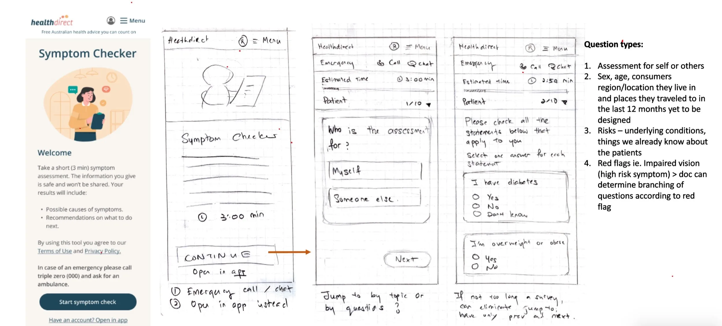
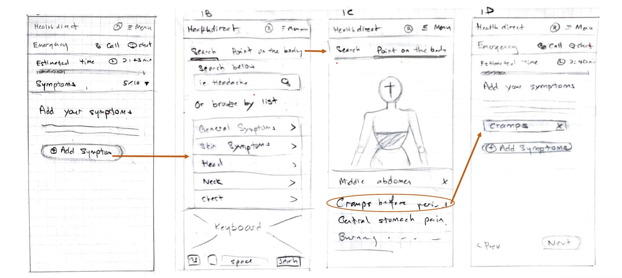
Rough concepts kept early debate on flow and framing, not visual polish.

Key design decisions
Every screen had one job: keep an anxious person moving toward care.
What user testing changed
See a GP outcome
“What to do” was reworded so the services read as a recommendation, not a paragraph to work through.
It now opens with a single sentence telling you what to do, with the important words bolded so people can scan it instead of reading every line.
The services then follow as numbered options. Each one says what the service is, what it costs and how you get seen, with a link straight to it.
Before
Advice, then one mixed list.

- The original 'See a doctor within 2 hours' page, captured whole: the pink outcome banner, a 'What to do' heading, two paragraphs of advice, then one bullet list mixing Alternate GPs, Virtual Care Clinics and Urgent Care Clinics with their explanations, closed by a single 'About these services' link. Below the advice the page continues into a 'Find a service' postcode search, a Virtual Care Clinic panel, helpline guidance, a 'Check another symptom' prompt, and the standard healthdirect footer.
- The redesigned page, from the top of the screen to the end of the options: the same outcome banner, a 'What to do' summary card stating you need to see a doctor within the next 2 hours, then three numbered options, 1. Virtual Care Clinics, 2. GP and 3. Urgent Care Clinics, each with bullets on what the service is, what it costs and how you get seen, and its own link.
Service guidance
The modal now covers a single service, with headings set as the questions people actually asked:
Do you need an appointment?How long is the wait?What does it cost?
Answering them clearly helps people pick the right service, which supports the goal of reducing avoidable emergency presentations.
Before
Every service, described in turn.
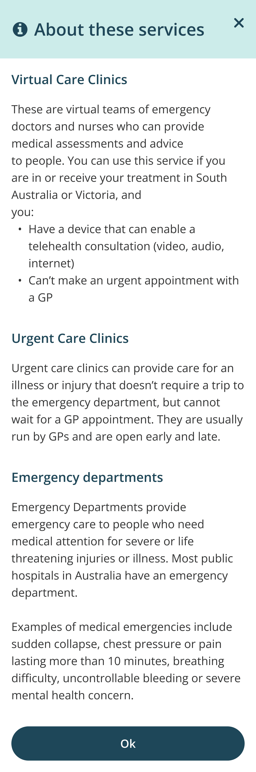
- The original panel, titled 'About these services', shown whole: Virtual Care Clinics, Urgent Care Clinics and Emergency Departments each described in a flat paragraph and a bullet list, one after another.
- The redesigned panel, titled 'Learn more' and scoped to Virtual Care Clinics, shown whole: a short description, then question headings including 'Do I need an appointment?' answered with 'No' in the first word.
- The same 'Learn more' panel scoped to Emergency Departments, shown whole: a description of severe or life-threatening care, then the same question headings, 'Do I need an appointment?' answered 'No. Walk-ins always accepted', wait times, and cost answered 'Free for Medicare card holders'.
Service distance
The list of nearby health services sorts by nearest instead of grouping by service type, and shows how far each clinic is from the set location.
The search radius is adjustable and starts at 50km. The wide default is deliberate: urgent care clinics are sparse, so a tight radius would hide them.
Anyone looking for other services, like a GP, can pull the radius in to 2km.
Today
Sorted by nearest, radius adjustable.

- The live service results for Urgent Care in Bowden: care-type filter chips with Urgent Care selected, a Filter button and a 'Sort by: Nearest' control, then a 'Search results' heading reading '50 results within 1166km', followed by result cards led by Total Urgent Care Norwood at 3.0km, each card carrying accessibility, bulk billing, opening hours and its distance.
- The Filters panel over the results: an 'Open now' toggle, a 'Search radius' group offering 2km, 5km, 10km, 20km and 'more than 50km' with the widest option selected, then Billing and Appointment type groups, above a 'Show results' button.
Accessible by design
Every question is one row and one decision, with three targets big enough for a thumb. No dropdowns, no typing, nothing that needs a steady hand.
'Don't know' sits beside Yes and No, so nobody has to guess their way forward and the engine gets an honest gap instead of an invented answer.
The four stages stay named at the top of every screen. Tested with people with disability and with users wary of technology, and built to meet WCAG for screen readers and keyboard use.

- The Background step on mobile with a four-stage progress stepper and health background questions, each answerable in one tap
Guided help
Where a question could trip people up, a 'More info and how to check it' link opened a plain-language explainer.
It spelled out what the question meant and how to check it, so people could answer with confidence without leaving the flow.

- The Assessment step asking whether you often have problems organising regular tasks or activities, with a 'More info and how to check it' link and Yes, No, and Don't know answers
- The 'More info' modal explaining what the question means and how to check it in plain language
Actionable advice
There was a bigger goal behind the results page: take pressure off emergency departments by steering people toward virtual care and urgent care clinics when those could safely treat them.
Results surfaced the information people actually weigh when choosing care: wait times, cost, and appointment requirements.
Clinics were numbered in order of recommendation, with essentials like 'No fee' and distance highlighted on each service card.

This prototype is tappable. Info icons open an explainer for each care option, and the Find links open that service's search.
- 'Seek immediate medical care' outcome page listing care options in order of recommendation — Virtual Care Clinic (no fee), Urgent Care Clinics, then Emergency Departments — above a Find a service search
- 'Learn more' explainer for Virtual Care Clinics covering how care is delivered, whether an appointment is needed, wait times, and cost (free for Medicare card holders)
- Service Finder results for Virtual Care in Bowden, with care-type filter chips and a single virtual care clinic result
- 'Learn more' explainer for Urgent Care Clinics covering in-person care that cannot wait for a GP appointment, walk-ins, wait times, and cost (many bulk-billed)
- Service Finder results for Urgent Care in Bowden, ordered by nearest, each clinic card showing accessibility, bulk billing, opening hours, and distance
- 'Learn more' explainer for Emergency Departments covering severe or life-threatening injuries or illness, walk-ins always accepted, wait times, and cost (free for Medicare card holders)
- Service Finder results for Emergency department services in Bowden, ordered by nearest, each hospital card showing opening hours and distance
Keeping momentum
Usability testing showed the encouragement screen added a human voice and propelled users forward.
Steppers and clear instructions eased anxiety through a long clinical questionnaire.
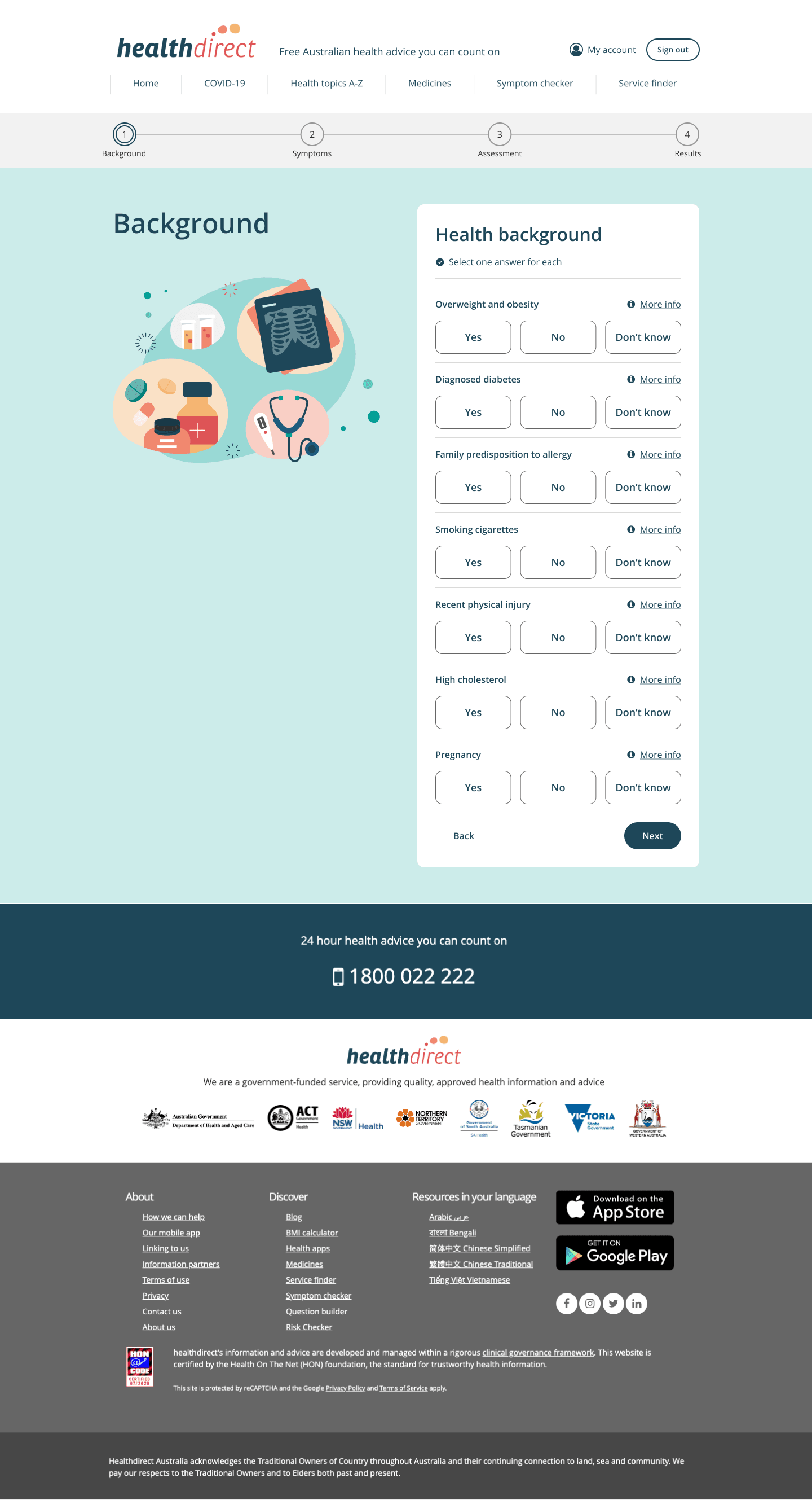
- Background step on desktop with a four-stage progress stepper across Background, Symptoms, Assessment, and Results, above the health background questions
- 'First step done' encouragement screen thanking the user before the symptoms questions

The outcome
Completion climbed from 49% to 84%, clearing the industry benchmark the redesign set out to hit.
People finished the check, and left knowing what to do next.
- Completion
- 84%Up from 49%, past the 60–70% target
- Reach
- 2MChecks a year, across jurisdictions
- Adoption
- 2×More used than the nurse helpline
- Right care, right place
- Only offers the pathways available to that person's location, time, and jurisdiction
- Connected to care
- Links straight to real-time appointment availability and booking through Service Finder
- A front door
- Became the foundation Healthdirect now calls Gen 2, its first step toward a national virtual front door
Designing symptom checker in Healthdirect’s native app
The Symptom Checker was prototyped for Healthdirect's mobile native app as a future build, featuring an additional “Follow-up Care Plan”, a guided experience that helps users manage their symptoms at home.
As part of this work, I developed motion design prototypes to enhance user engagement and bring the interface to life. The concept was pitched to the business as a case for hiring a developer specialising in interactive animation.