Michi
Overview
Michi is a little companion for the moments when anxiety takes over. It's an iPhone and iPad app with a small animated character who breathes with you when everything feels like too much, and keeps you company on the calmer days in between, with short lessons, gentle activities and a place to notice what went well.
- Role
- Product designer and developer, end to end. Designed and built solo
- Platform
- iOS and iPadOS, built in Flutter with a Supabase backend
- Timeline
- 29 August to 5 October 2026 (about 5 weeks, mostly weekends)
- Status
- In TestFlight beta, build 16
A little companion for when anxiety takes over


The problem
Most wellness apps stop at meditation.
Few help in the moment anxiety hits.
The reframe
Help within seconds, on your worst day
Based on research, people don't leave an app because it's missing features. They leave because it takes too much effort. Daylio, a mood diary, still keeps around 40% of its users after a month, and an entry takes just two taps.
I want Michi to be the type of app where, on your worst day, you get help within seconds, without having to sign up first.
- of people a typical mental health app keeps by day 15
- 3.9%
- of people a typical mental health app keeps by day 15
- drift away within the first ten days
- 80%+
- drift away within the first ten days
Process
It started as
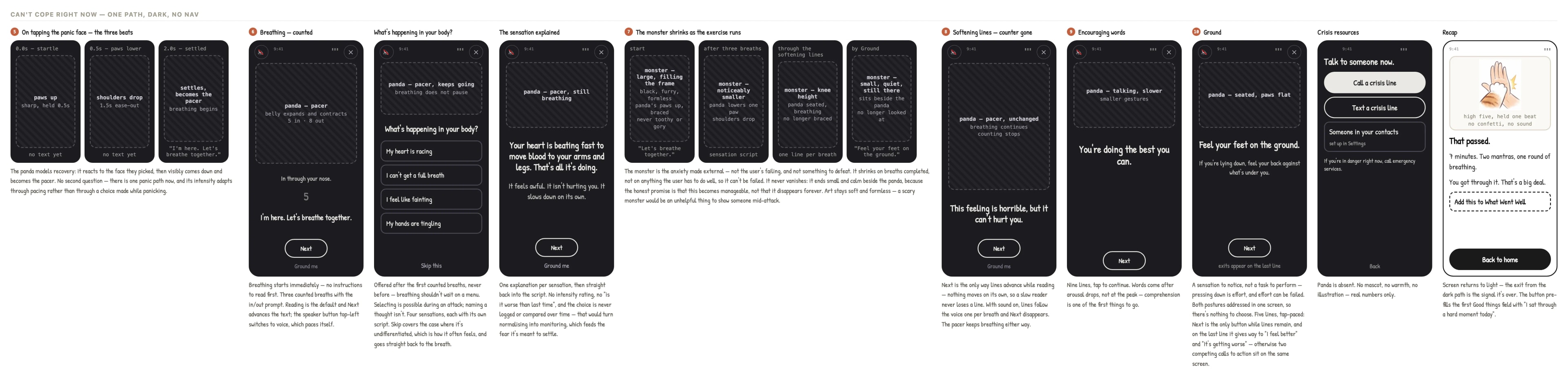
annotated wireframes
Mapping the panic path
I wanted the character to be a companion: a friend who feels the same way about anxiety as you do. Kind and brave, and growing a little each day as you both learn to manage it together.
I wanted the character to do a breathing exercise together with the user in the middle of a panic attack. It starts with a pacer that takes them through breathing first, then naming a body sensation, then calm lines explaining that the body's reactions will pass and settle on their own.
Testing the themes
I explored the themes in Claude Design, trying each palette on the Me screen in light and dark mode.
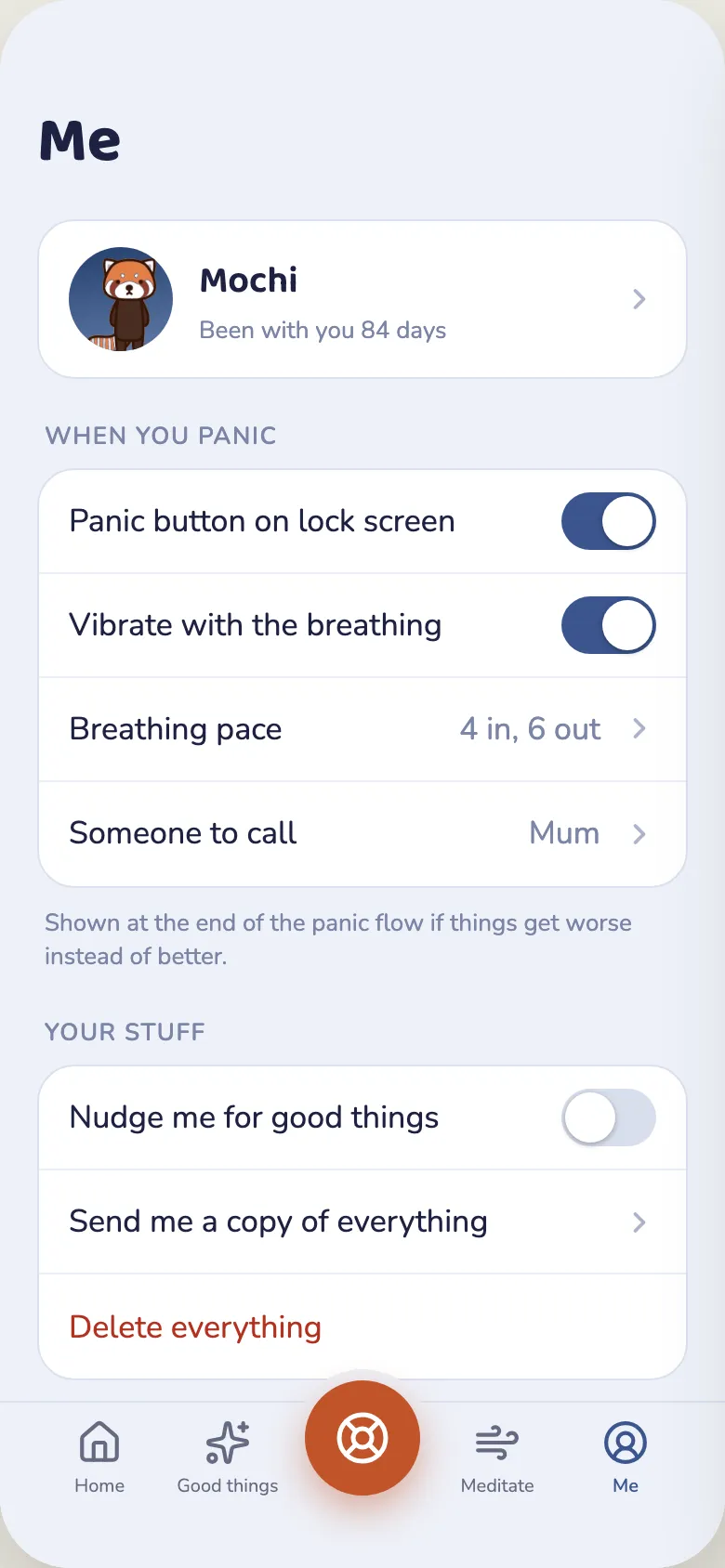
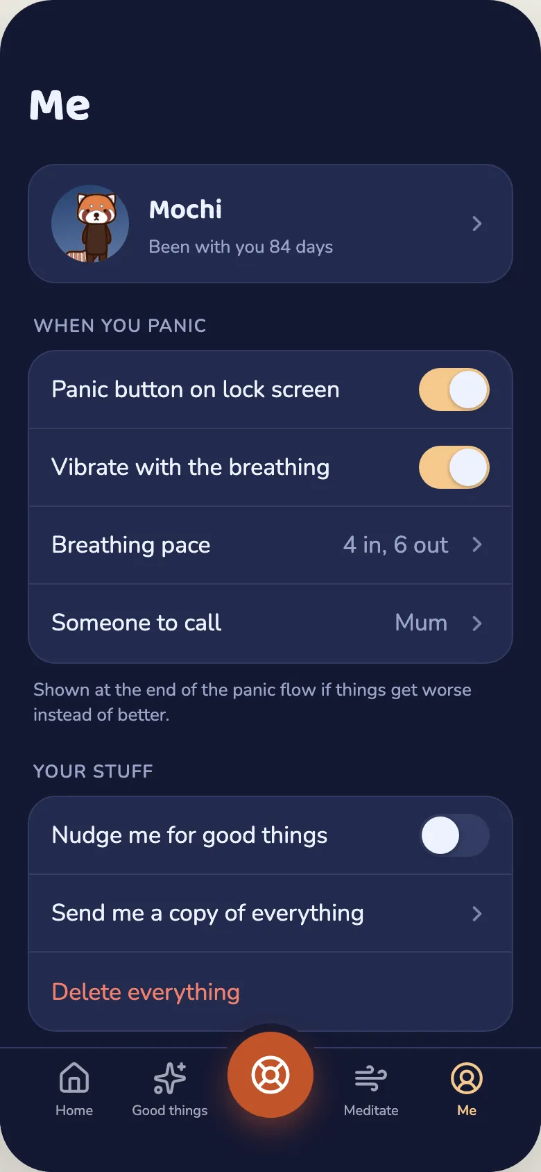
- The Me screen in the Moonlit valley theme, in light and dark mode.
- The Me screen in the Harvest moon theme, in light and dark mode.
- The Me screen in the Night forest theme, in light and dark mode.
- The Me screen in the Lagoon theme, in light and dark mode.
- The Me screen in the Coral diorama theme, in light and dark mode.
- The Me screen in the Dusk terrarium theme, in light and dark mode.
Animating the characters
I created Mochi, Momo and Maui in Google Flow, then traced each one by hand in Rive and learned to rig their bones to the parts of the body. Only then could Claude Code animate them.
I wrote animation principles into a skill. Claude then keyed in the poses on the animation timeline and set up the state machine through the Rive MCP, a connection that lets an AI work inside the Rive editor, while I directed.
Generate
Me, by hand
Characters designed in Google Flow.
Trace
Me, by hand
Edited and traced by hand.
Rig
Me, by hand
Bones bound to the body parts; pivots and draw order set.
Teach
Me, by hand
Animation principles written into a skill, so Claude moves the character like an animator would.
Animate
Claude, directed by me
Poses, keys and the state machine, through the Rive MCP.
Check
Claude, directed by me
Breath events added back, simulated, exported, compared byte by byte.
Ship
On a real phone
Swap every friend, tap, breathe two full breaths.
Step 5, Animate
The loop for every animation
- Key the extremes
- Build in stages
- Push 10 to 30%
- Check the list
- Prove on simulator
Not right yet? Go round again.
Step 6, Check
Every session ends with this
- Add back the two breath events
- Simulate: both events fire for the breath animation, in time with the script and audio
- Turn every layer back on
- Export the file
- Compare with the last file
- Run it in the app

How I built my tools
I built my own tools,
so Claude works the way I do
How I work on Michi
Michi moves through five steps, from what the science says to a build on the Simulator, then on my phone. What testing shows me feeds back into the start.
Research
What does the science say? A research agent finds studies and grades the evidence.
Tools: Claude Code
Design
Wireframes and the design system: colour, type and spacing.
Tools: Claude Design
Build
Specs first, then vibe coding the app in Flutter.
Tools: Claude Code
Animate and voice
The character in Rive, driven through the Rive MCP. Voices from ElevenLabs.
Tools: Rive, ElevenLabs
Test
On the Simulator, then with testers on TestFlight.
Tools: Simulator, TestFlight
What I learn goes back into the research, the design and my tools.
Under every step: my own skills, agents and tools, so Claude works the way I do.
The tools I built to work faster
Each mistake or slow job became a tool, so it never happens twice.
A mistake or a slow jobbecomes: Turn it into a skill, agent or tool
Research
A research agent reads studies and writes a short brief that grades the evidence.
Breathing and panic
Mindfulness and exercise
How fast a calm voice speaks
Supporting someone in crisis
- Research: A research agent reads studies and writes a short brief that grades the evidence. Breathing and panic. Mindfulness and exercise. How fast a calm voice speaks. Supporting someone in crisis.
- Skills: Rulebooks Claude reads before a job, so every screen follows the same rules. /visual-style, colour, type and spacing. /rive-animator, how the character moves. /meditation-writer, guided scripts. /pace-check, the pace of every voice line.
- Agents: Seven helpers that do one job and report back. Each runs on the right model: Haiku, Sonnet, Opus. Three checkers, run side by side after every change: design, tests and words. rive-worker, does the long Rive jobs. science-researcher, finds the evidence.
- Custom tools: Small apps and scripts for my own work. Copy desk, review every word and voice line. Voice clip cleaner, one loudness, no clicks. Design audit, finds styling typed in by hand. Worry tuner, sketch the creature's physics.
Memory: every lesson becomes a short note Claude reads next time, so the same mistake is never made twice.
Inside the skills and agents
Each file opened at the lines that do the work, and why I wrote it.
/visual-style
Colour, contrast and spacing bugs don't look like bugs. This makes Claude load the rules before touching any screen.
.claude/skills/visual-style/SKILL.md
- Excerpt of the visual-style skill file. Its frontmatter says to load it before changing anything the user sees. The lines kept set one test, open the screen in Moss light and one dark palette at 200% text on an iPhone SE and then an iPad, and the first rule: colour comes from the theme, never a hex literal, because a hardcoded colour is right in at most one of twelve schemes.
- /visual-style. Colour, contrast and spacing bugs don't look like bugs. This makes Claude load the rules before touching any screen.
- /pace-check. I first set every ElevenLabs line to the same speed, and the calm lines sounded rushed. This measures each line against the pace its meaning wants, so I only listen to the lines it flags.
- /rive-animator. A skill that tells Claude how the character moves: calm, small, soft and cute.
- ui-checker. After every visual change, it runs the contrast, accessibility and design checks and reports only what failed.
- rive-worker. Rive jobs produce huge amounts of output. This agent does them on its own and hands back a short summary.
- science-researcher. Every feature starts from evidence. It finds studies, grades how strong they are, and writes a brief in plain words.
Tools for the voice, the words and Worry
/pace-check for the ElevenLabs voices, a copy desk for every line in the app, and a tuner for how Worry moves.
The voice: from script to screen
Write
A writing skill sets the voice of the script.
Record
ElevenLabs reads each line.
Clean
One loudness, soft edges, no clicks.
/pace-check
Is each line at the pace its meaning wants?
My ear
I only listen to the lines it flagged.
In the app
Timed into the guided screen.
Why I built /pace-check: at first every line was set to the same average speed, and the calm lines sounded rushed. Now calm lines (“Feel the weight of yourself”) run a little slower, and lively lines a little faster.
The words: a copy desk
Gather
Every script line, brief and voice clip, pulled into one web page.
Mark
Keep, Change or Cut, plus a note. I can play each voice line.
Hand over
Claude reads my notes. Each line knows its file and line in the code.
Updated
Claude edits the code and reports back. I refresh the page.
Why: the words lived in dozens of code files. Now I review them like a writer, not a programmer.
Key design decisions
I tried hard not to decide things on taste alone. Most of the big choices came from research, or from catching something I'd got wrong.
Writing like a kind friend
I wanted Michi to talk the way a kind friend would, so I wrote a style guide for it: no blame, no streaks, and no counting the days you didn't get through your tasks.
For the character's poses and expressions, I looked to characters on Pinterest for ideas about what it might do or feel. For the MVP, I slimmed this down to a character who moves with you, like exercising alongside you. That kept the work scalable and within budget.
No sign-up wall
You don't have to sign up to start. Michi gives you a private, anonymous account the second you open the app, so you can get help with your anxiety straight away. It only asks for an email later, and only so you don't lose your good things.
Core features
A quick path for hard moments and features that help the user grow a little towards wellness each day.
From four faces to a dial
The feeling picker started out as four faces in a grid. The panic face was twice the size and always came first. In late September I swapped the grid for a dial. A dial puts every face on one line, so what you're really choosing is how much help you want, not how bad things are. I also added Good and Really good, so the dial has a happy end too.
Meet Worry
The problem. Anxiety is really hard to talk about, partly because you can't see it. So I gave it a shape: Worry, a soft little monster who stands in for the feeling.
The idea. Therapists call this "externalising": the feeling sits outside you, so it is something you have, not something you are.
Designed in code
I designed Worry in code rather than in a drawing tool. A small tuner page let me shape her and try each face, and the app draws her from the same shapes. She can be dragged around, and tapping her makes her bounce, so she feels more interactive. These are five of her moods, from crying to calm.





Key decisions
- She calms down but never disappears. Anxiety does not vanish. The design does not promise that it will.
- She reacts while you write. She starts upset and calms as you type. The user sees calm happen, so the app does not need to tell them to calm down.
- Safety in the details. If someone writes about self-harm, the app never says "let it go", because that can sound like giving up. It offers a real person to talk to instead.
Worry tuner
What it is
- A page I made to get Worry right before I built her into the app: how she looks, and how she moves.
- Switch between her six faces, from crying to content.
- See her next to the main character at her real size.
- In the little hillside scene, grab her, drag her around and throw her.
How I use it
- Drag her around and watch how she moves. She bends behind your finger, stretches when she moves fast and wobbles a bit when she lands.
- When something feels off, move a slider and try again until she feels right.
- Then press Copy settings, and those numbers go straight into the app.
Why have it
- Changing a slider takes a second. Changing code, rebuilding the app and checking it on a phone takes much longer.
- The sliders change the same settings the app uses to animate her. So if she feels right on the page, she moves exactly the same way on the phone.
Good things: design decisions
Why jotting down good things helps
When you're anxious, your brain keeps looking for bad things. Writing down good things gives it something kinder to find, and the more you do it, the easier they are to spot. Doing it often matters far more than doing it perfectly.
- Just one thing at a time. The screen only asks for one good thing, in one box. Once you save it, the box clears, so you can add another if you feel like it, up to three a day. Three empty boxes would feel like homework. One box feels easy, and easy is what brings people back.
- No streaks, no counting. Lots of habit apps count how many days in a row you've shown up. I chose not to. Missing a day and losing a streak feels like failing, and that's the last thing someone with anxiety needs.
- The "why" is there, but it stays out of the way. At first, the reason this helps sat right under the box. But you only need to read it once, and by your fortieth entry it's just in the way. So now it's a small "Why this helps" link. Tap it and a different character explains, like a kind teacher. That way it feels like a little lesson, not a friend lecturing you.




A sky that follows your day
Home has twelve skies, one for each part of the day. The phone works out sunrise and sunset from its own time zone, so Michi never asks where you are. The sky changes in steps, not a slow blend, so nothing creeps behind the words while you read.




A card a day
Home deals one painted card each day, and you turn it over to read a small thing to notice. Pictures of the prompt itself didn't work, so a landscape sets the mood the words are read in instead. The same cards come back when you pass a kind line on to a friend.
Where it is now, and what I learned
Build 16 is in TestFlight
Outcome and lessons
In five weeks, Michi went from wireframes to build 16 in TestFlight, with beta testers using it on their own phones. Next up are a subscription, a legal review of the safety features, and then the App Store.
Research can change the product, not just the pitch
One finding about deep breaths rewrote the most important screen in the app.
Sometimes less is the feature
Leaving out streaks, counts and sign-ups made Michi kinder, and the research suggests it helps people stick around too.